With the goal of replacing my questionably-proprietary R, I decided to scrawl a fresh svg in InkScape. After an embarrassing number of revisions and rework, gravitating further away then back towards the original design, here is the final product.

I wanted the new image to meet the following criteria:
- Must look good in a circular or square format.
- Should be highly scalable and look good when tiny/huge.
- Mono/Dichromatic color scheme, for visual simplicity.
- Needs to look professional/sharp and usable in a business environment.
- Made by me; no attributions, payment, credits, etc.
Getting my tablet set up on Fedora 28 was a breeze; plug and play, full support, no drivers. Using inkscape for the first time was neat; I really appreciate the properties of vector graphics, and how much smaller they can be than png/jpeg/gif due to their mathematical nature.
Here are a bunch of the revisions:
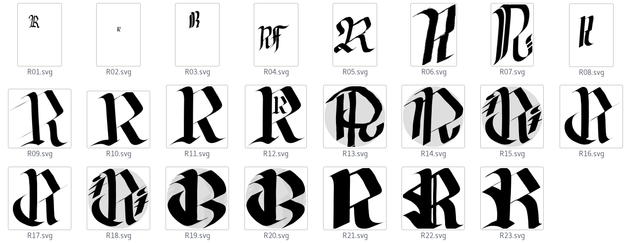
I settled on Revision 17 for a while, but became unhappy when I saw how it looked as a slack profile image. It didn’t scale how I wanted. I felt it was too thn to properly fill out square spaces.
| Revision 10 | Revision 12 | Revision 17 |
|---|---|---|
 |  |  |
Here I was attempting to visually fill the circle shape. A thin R didn’t make the bold impression I needed it to as a profile/small image.
| Revision 18 | Revision 19 | Revision 22 |
|---|---|---|
 |  |  |
Designs 19 through 23 were a fair bit thicker. Though 22 was much better at smaller sizes, I really liked the thin lines of designs 10-12. The lent an elegance to the design that were not present in the original profile image or any of the thicker iterations. A final visual refinement, 23, attempted to strike a balance between 22 and 17. I feel I did a fairly good job:
| Revision 22 | Revision 23 |
|---|---|
|  |
So, next time you’re out to make a personal logo for yourself, don’t turn to GIMP or Adobe Photoshop; make yourself a clean, infinitely scalable SVG! Next step is to replace my signature, followed by some little doodles and generic diagrams.
Update: I’ve unfortunately gravitated even closer to the original design; perhaps I’ve just become accustomed to seeing this shape. Eventually I hope to play with Inkscape more to make an interesting, original design.
| Revision 23 | Revision 25 |
|---|---|
|  |
I’m clueless about personal branding, but I think something unique that I’ve created myself must be a step in the correct direction.
Thanks for reading,