When given the task of standing up an election system for the IEEE uOttawa student chapter, I was faced with a choice: improve the old solution, find another existing solution, or write a new solution from scratch.
Though it came at the cost of dramatically more work, I chose the green-field project; who wouldn’t leap at the chance to design a new and improved solution for a clear and defined use case with at least one guaranteed customer?
Within this article, I explain the decisions, situations, mistakes, and battles won while assembling the Democracy web app.
The Task at Hand
Back in September of 2020, during an IEEE uOttawa meeting, it was brought to my attention that I had to ensure that a mechanism existed to run the elections to recruit a panel of executives for 2021. Awesome!
The previous years’ system had used Google OAuth for verification, and since the University of Ottawa had since moved to Microsoft for its email and student productivity systems, it was no longer guaranteed that all students could register with a system using Google OAuth. The clear solution to this was to simply implement Microsoft as an OAuth provider, but then, how long would that last?
In order to ensure each student was unique, any OAuth provider under consideration would need to guarantee access to an email address associated with the account, to ensure students could not log in from multiple uOttawa-associated OAuth services and vote in elections.
Wanting to either fix the current system as to make it future proof, or build a new one that could last a good 5 years at least, I decided that changes in the University’s choice of productivity suite could not be a primary factor for authentication, as it would require updates with every change to the suite along with updates when OAuth endpoints change or APIs are updated.
And so, I chose simplicity.
My eternal friend, plaintext email, was clearly up to the task; by ensuring students had access to their uOttawa email inboxes, I could semi-reliably ensure that every student was only able to vote a single time. (Eventually this assumption would be proven wrong, and multiple additional securities added to ensure only a set of students could participate in any given election.)
Eventually I could add OAuth support and allow easy authentication via Microsoft, Google, etc, as long as the access keys gave me access to the account’s primary email address. Support could even be added for Github or Facebook login as long as the account was associated with a uOttawa email address.
At this time, the IEEE voting system created by the previous Webmasters was designed to support a single election, after which the database could be cleared in preparation for the next event. After some consideration, I decided to write a completely new system from scratch that would enable election managers to configure and run elections without the need for me, the webmaster, to manually edit JSON and toil to hard-code parameters.
The stage was set for the development of a new voting app!
Planning
I knew that it would be easiest to solve this problem with the tools I already had in my belt; React, Django, and all the fixins’. This killer combination is easy to write and deploy, and with the right caching logic, could easily serve hundreds of users while running on a PaaS with a modest amount of computing power and memory.
React is a front-end development framework that enables stateful component-driven application development. Components are re-usable, and many visually pleasing component libraries are available to dramatically reduce development time.
React makes it painless to create interactive UIs. Design simple views for each state in your application, and React will efficiently update and render just the right components when your data changes.
Django is a MVC web framework, though I’ll only be using it to deploy a RESTful API for managing user and election data. Combined with a PostgreSQL relational database, and Redis instance for caching, the new system will be scalable, responsive, and minimal.
Django is a high-level Python Web framework that encourages rapid development and clean, pragmatic design. Built by experienced developers, it takes care of much of the hassle of Web development, so you can focus on writing your app without needing to reinvent the wheel. It’s free and open source.
With these technologies in mind, I began brainstorming and writing draft user interfaces on paper. Soon after that, I realized that this project was going to be quite large; I would need help!
Small Minds
Uncomfortable with the idea of facing the project alone with minimal time, I cast out my net and searched for friends with the time and expertise to join me in creating the system.
I wasn’t looking for charity per se, I pitched working on the system as a partnership in a faux startup, rather than contributing to an association’s election project. By working with me, my new staff member would be building an application which would look great on a resume, which could be monetized with enough work and polish.
With this net cast, I caught the attention of a few people.
Ultimately, I only decided to onboard and work with one person on the project, that person being Max Chen, a fresh Computer Engineering graduate and close friend. Evolving the team to two people inevitably inspired some pseudo-startup branding, and so, Small Minds was born.
The name Democracy was chosen as a working title for the project.
More Planning
At this point, Max and I started to work on both paper sketches and proof-of-concept web apps to test page layouts, authentication, and backend access.
Svelte, Svelte Native, and React Native Web were all considered as candidates for implementation. Working prototypes for each platform, including the basics of connecting to the backend (authenticating, sending/receiving data, basic styling,) were implemented, but ultimately, we decided to stick to vanilla React.
While our first designs included a complex hierarchy for the creation and management of organizations, Max made a pragmatic call to scrap organizations for the first version of the system, and allow users to run elections directly. This simplification dramatically cut down the number of views we would have to create and test.
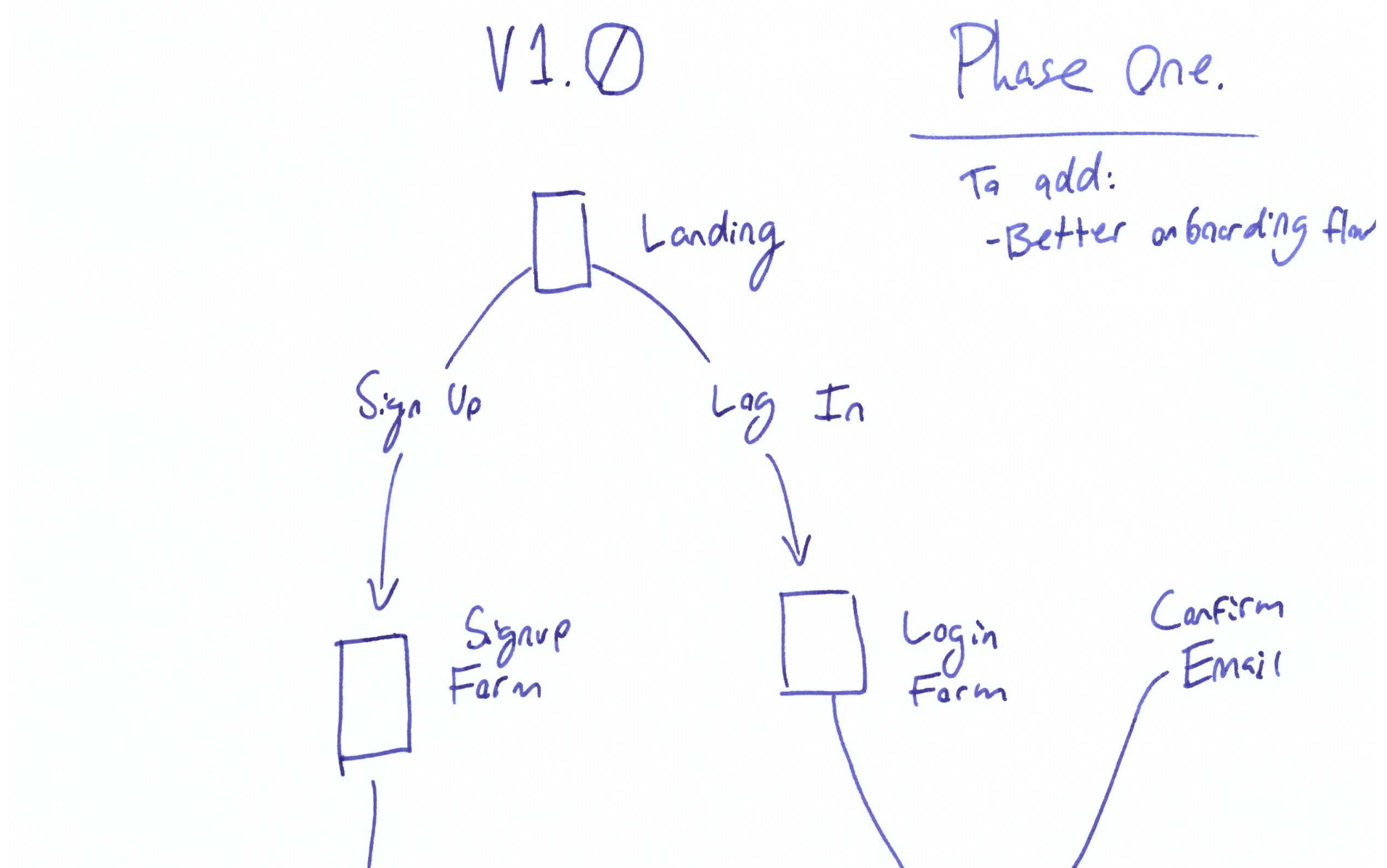
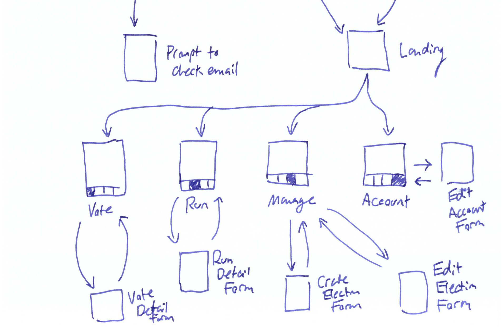
Here was the third or fourth draft of our user view flowchart, which was relatively close to what we would ultimately implement, though with a few additional pages missing. We were attempting to design an MVP:
Our first major conflict arrived when Max and I clashed on some of the UI design. Max was invested in crafting a styled UI with punchy colors:
I on the other hand (as you have probably noticed while viewing this site,) am a devout practitioner of minimalism and industrial design. While there is certainly a place for art, the egg would ultimately land on my face if we could not finish the system in time, and so I made the decision to use the rsuite component library and forsake custom components.
Why design a component library ourselves when there are libraries out there that have been built by teams of consummate UX professionals, who have accounted for accessibility and ironed out bugs as millions of users have used the components?
Multilingual support was one of our first considerations when designing the user interface; IEEE uOttawa required the UI to be available in French and English; Max and I both wanted the system to easily support English, Chinese, and French. Using the i18n library from the beginning of the project made it very easy to localize the user interface when the time came to collect translations.
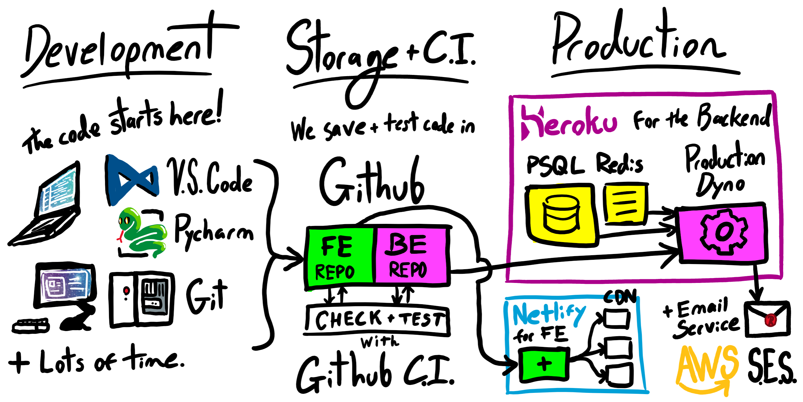
At this point, we had a rough idea of how things were going to be written, stored, tested, and deployed:
Implementation
In the first week of January, Max and I began working in earnest, our first deadline for creating the voting system being the end of January, expecting elections to be sometime in February.
By the third week of January, about half of the required backend endpoints had been written, and Max had created a landing page on top of one of the earlier prototypes which included React, a router, and functions for JWT Authentication with the backend.
At this point in time, having previously set up a division-of-labor situation where I would complete the backend and Max would complete the frontend, I realized that (due to my responsibilities and potential vision for the frontend,) I would need to step in and begin managing and contributing to the frontend. After this change, progress sped up considerably.
From this point forward, implementation was quite regular; I would assign Max tickets in Github with complete descriptions and goals, and in the meantime, I would tackle the remaining frontend and backend tasks as I saw fit. In a perfect world, I would have written all the tickets at the beginning of sprints, and reviewed the UI after each sprint. Max would have been able to take on more tickets instead of having to ask me to pull more out of my head. Given our small team size, the organic handle-as-encountered system that was ‘used’ still enabled us to produce a high-quality, low-bug app, while being able to bend around our fluctuating schedules.
Blowing past the Feb 1 deadline, I inquired with the other IEEE uOttawa execs about the actual election timeline, and with great relief, learned I had an extra month to complete the project.
It’s true that estimated time for a software project is always double the original estimate, even when you take this phenomena into consideration.
Gathering Requirements
You may be asking yourself, “why is the section on gathering requirements after the implementation section?”
In my infinite wisdom, I had failed to push the other IEEE uOttawa execs to provide a detailed set of requirements and success criteria for the election. Two weeks before the election, I was asked several times “Oh, does your system include X?”
No! It did not!
If I was to take away one thing from this project, it would be to “ensure you have all the requirements before you design your data models and software architecture.”
Each of these additonal features had to be carefully considered, as every one would require some fundamental changes on the backend and frontend.
Final Software Architecture
Apart from a minor change in email provider from Mailjet to SendGrid to AWS SES, the technologies chosen at the beginning of the project saw us through and performed without breaking a sweat in production.
Technology Used:
- Backend
- Cookie Cutter Django (Python 3.8)
- Django Rest Framework
- Django Allauth
- Simple JWT
- Redis (fast key-value cache)
- PostgreSQL (relational storage)
- AWS SES (Simple Email Service)
- Sentry (error monitoring)
- Swagger (automatic API documentation)
- Frontend
- React (TypeScript)
- i18next (translation)
- RSuite (component library)
- Gravatar (profile pictures)
- Sentry & Google Analytics
In addition, we had plenty of help: Good IDEs (with vim plugins, of course,) and lots of linters, code formatters, and type checkers for both Python and TypeScript.
When deployed, the architecture functions like this:
- Our Django backend is responsible for exposing API endpoints to read and modify election, candidate, and ballot data. We utilize CORS to allow requests from the frontend domain.
- Heroku provides Redis/PostgreSQL databases.
- AWS SES provides an endpoint to deliver e-mails for account verification.
- Our React frontend is deployed on the Netlify CDNs and sends API calls to the backend deployed on Heroku.
While simple, this deployment strategy gives us the easy ability to quickly hyperscale, as the delivery of the app via Netlify, and compute-power/memory available on Heroku, can both be rapidly and easily scaled with money.
Aside – AWS SES was not our first email delivery service; we originally
opted for SendGrid, then MailJet, as the free tier allows up to 200 emails sent
per day. We switched to SES as the first tier for both SendGrid and MailJet is
around $15 USD, and both provide lots of analytics and templating features that
Democracy does not need. AWS SES charges a measly 10c per 1000 emails,
making it a no-brainer for scaling our plaintext email verification system.
Deployment
Modern software development has yielded services which can make running and scaling your service as easy or horrendously complicated as you’d like.
Heroku makes it crazy easy to deploy backends and full web-applications. From a Github repository, you only need to navigate to Heroku, select the repository you would like to deploy, add databases and services with a few clicks, fill out environment variables, and hit go.
This experience is breezy and painless when compared to traditional deployment on an owned server, in a container in GCP/AWS/Azure, or on a VPS. Traditionally, deployment is a long and tiresome process involving plenty of configuration and pain.
The tradeoff? Money. Heroku is more expensive than a VPS like Digital Ocean, and provides fewer resources. In this situation (and probably many situations like mine,) it’s worth the extra $2 USD per month to skip the hours of configuration time and have the peace of mind that Heroku’s monitoring services provide.
Netlify, in a similar manner to Heroku, makes it crazy easy to deploy websites on personal domains, with SSL enabled, and assets served over CDNs automatically. You would also need to do lots of configuration or use a second service like CloudFlare to do this on your own. The best news; for a project this size (less than 3000 viewers/users in a month,) the amount of bandwidth Netlify provides means your web app will be deployed and served free of charge.
Utilizing services like Netlify and Heroku shift most of the system configuration from you, the developer, to the service. Though this dramatically shrinks the time required for deployment, it comes at the cost of reduced control and reduced CPU power per dollar spent when compared to other platforms.
Aside – Just today (2021-03-22) GitLab posted a thought-provoking article
titled
“We are building a Heroku for production apps in hyper clouds”
in which they discuss the appeal of Heroku’s workflow and their planned steps to
improve the experience on their own platform. Eventually a technology that is
more integrated than Heroku may replace it, but for now, everything else is a
cheap imitation. Accept no substitute!
Final User Interface
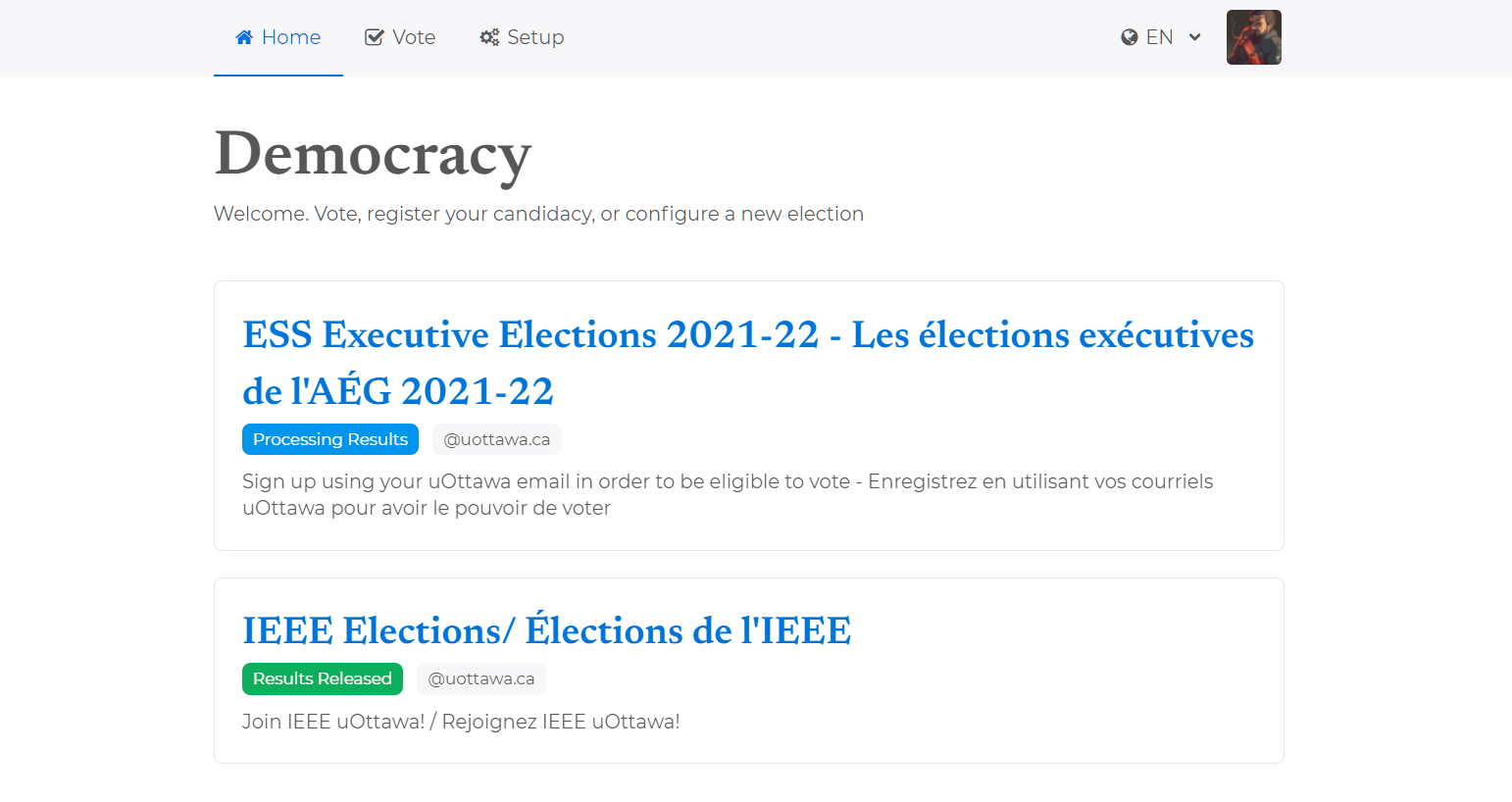
After signing up or logging in, users would find themselves on the landing page, with a list of active elections. Elections were given colored status badges to communicate the current election phase.
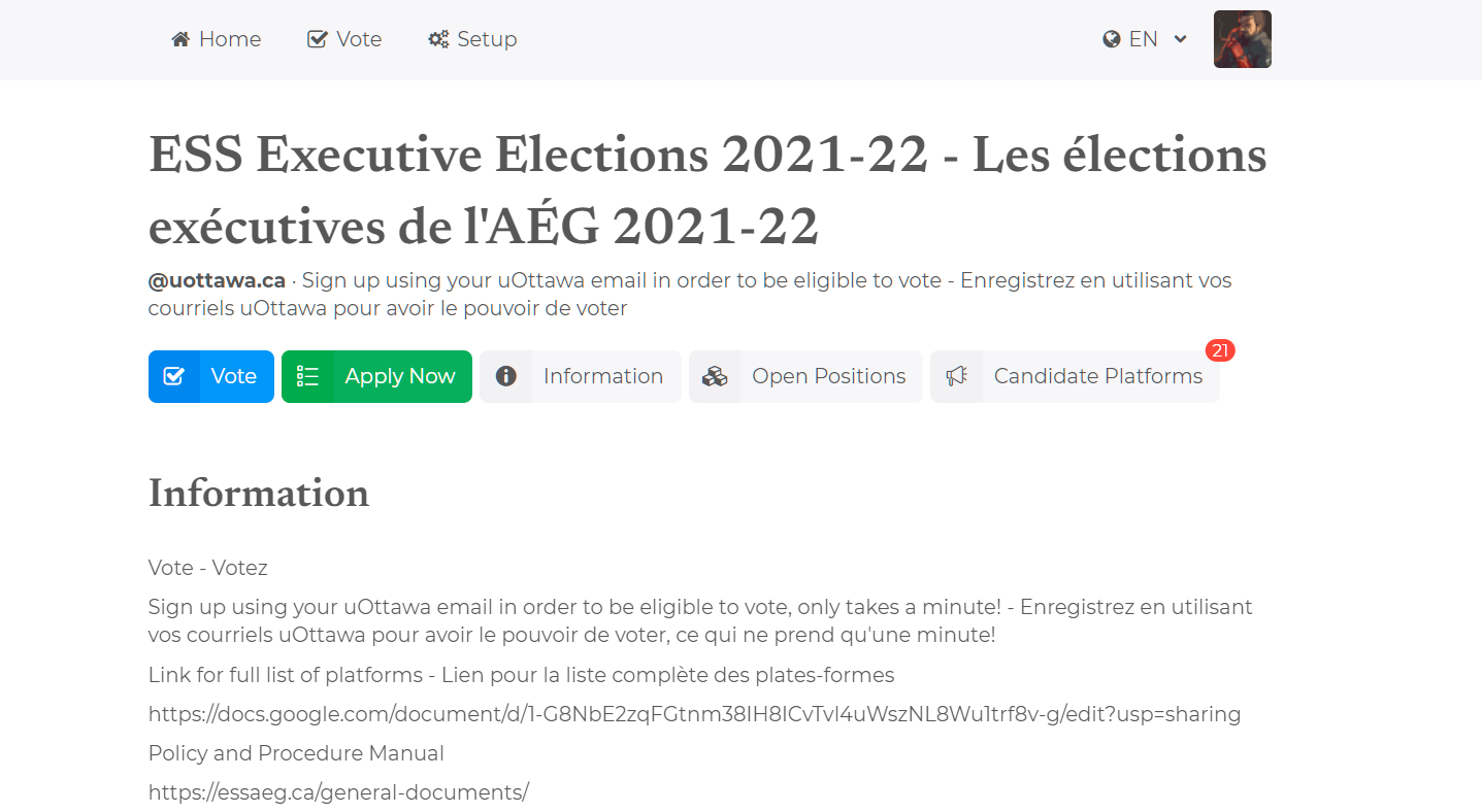
Navigating to one of these available elections, users will see:
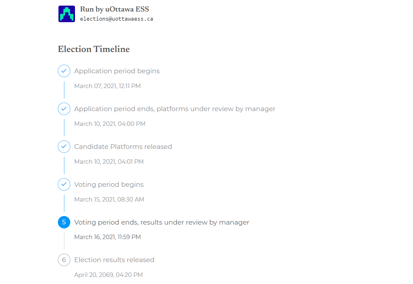
A timeline is provided for users to understand how far the election has progressed, and what will happen in the coming days and weeks. This component was reworked after feedback from some helpful users that the original timeline was difficult to read and understand, and didn’t include enough color.
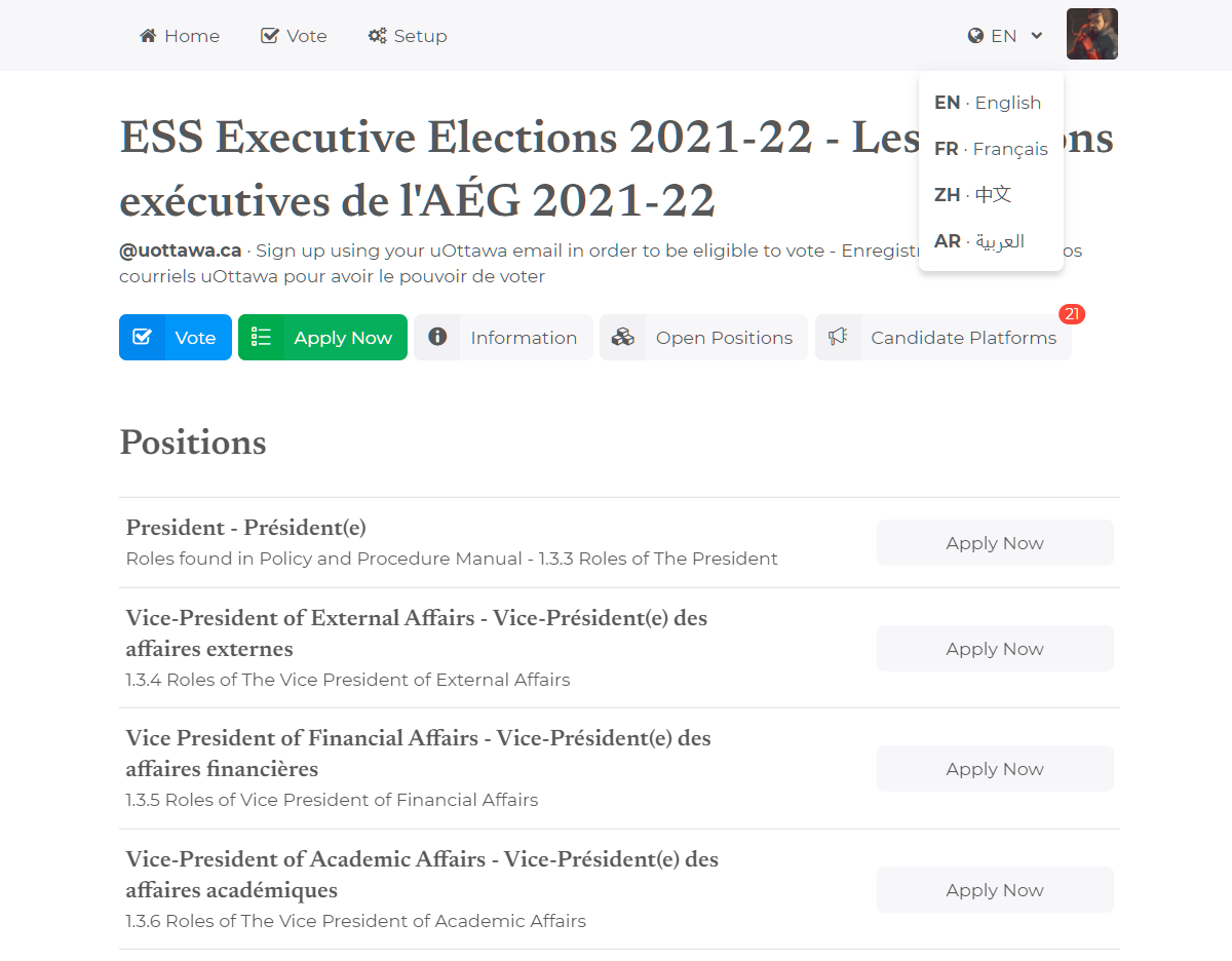
Clicking “open positions” will show a list of posted positions for the currently viewed election:
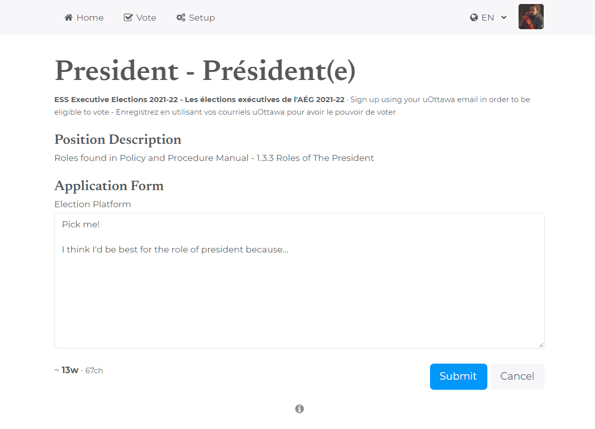
Applying for a position will open a page with an application form. A word and character count is provided so users can more easily adhere to application instructions, which appear at the top of the page.
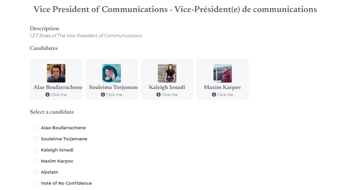
When voting time rolls around, users will be able to access the ballot form, which has many sections containing a position, all relevant candidates, and clickable cards to show the platform for each candidate.
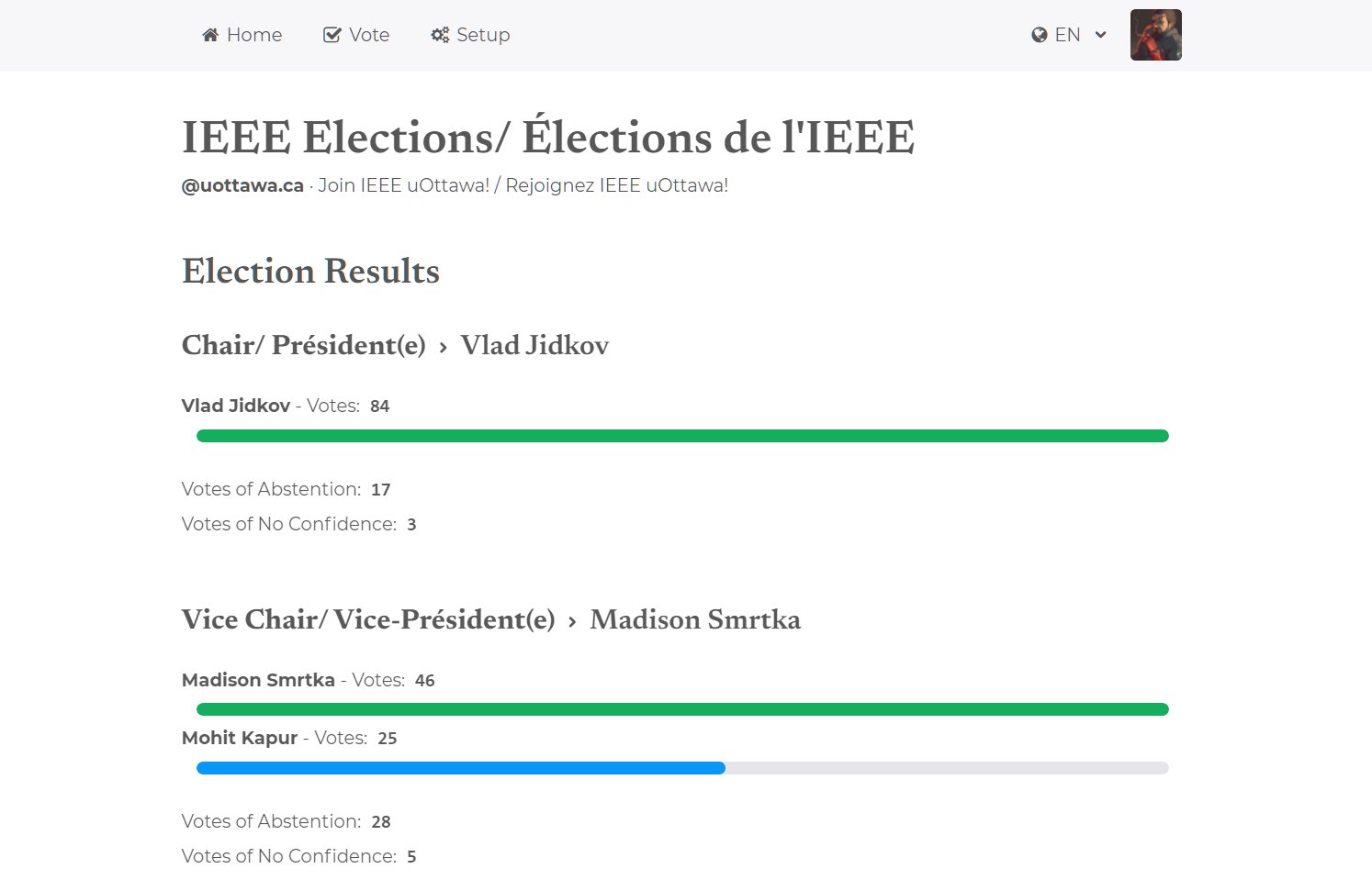
Finally, when the election has concluded, a page will be displayed to communicate the results of the election, and (unless a tie has occurred,) will color the share of votes for the winning candidate green.
Above is the majority of the pages visible to users on the site, but a tremendous amount of work was put into the tools, modals, and configuration windows hidden behind buttons in the election administration interface.
ESS Election
Roughly two weeks before it happened in early March, I was asked if Democracy could support a ~500-1500 participant election. I did the math, and Heroku’s free tier database could not support over ~600 users voting. Luckily, ESS was more than willing to pitch in the $9 USD to upgrade the Heroku database to a higher tier, enabling up to 50,000 uOttawa students to participate in the election.
As the ESS election would occur before the IEEE uOttawa election, it would be the first scaled test of the system, and also the largest!
Five Minute Waking Nightmare
Well, well, well, if it isn’t the consequences of my actions!
The day had arrived. March 15, 2021, 0830h. A few days before, I had added caching logic to deal with the additional volume, worried that Heroku wouldn’t be able to handle the volume of users. I had also hurriedly added Sentry and Google Analytics the night before, seized by a fear that some obscure device would not be able to correctly render the frontend.
At 0827, I noticed a critical bug in my caching logic.
When returning the election information to the frontend, I included some additional computed data related to the user viewing the page. The data was superficial and could have been computed from the frontend, but including a boolean on the backend was easier. This did mean that the data was unique to the user viewing the page, and should not have been cached.
I noticed the bug when I opened the election page and it told me I could not vote. This meant that somebody with a non-uOttawa domain had viewed the page just before me. Rats!
I was blessed on this day to have the power of Heroku on my side; in barely a
few minutes, I had written a patch and redeployed the backend, just in time for
the massive influx of voters opening and using the system between 0830h and
0930h.
Obvious Takeaway: Don’t deploy untested last-minute features to production if you don’t want your app to blow up in unforseen ways.
ESS Results
Apart from some warnings due to an outdated whitelist, the ESS election went exceedingly smoothly. While there was some minor confusion regarding who could vote (Computer Science students were not allowed to participate,) there were zero errors reported by Sentry on the backend, and one or two Sentry errors reported on the frontend, though these were reported from Safari preview for iOS and Instagram browser, and I didn’t receive any direct complaints from users regarding these issues.
IEEE uOttawa Election
As the scale was predicted to be lower, and the system had already been tested with a larger crowd earlier in the month, the IEEE uOttawa election was far less stressful than the previous event.
A modification had to be made to the backend, ensuring that only uOttawa emails with
the typical [a-z]+[0-9][0-9][0-9] user format would be allowed to register and vote.
With that change, there was no administrative overhead to add people to the whitelist
as the election progressed, so the process was entirely automatic.
In the future, presenting election administrators with a regex field in addition to the whitelist would be helpful for reducing this one piece of election-specific code.
Takeaways
My most ambitious personal project ever left me with many lessons about communication, teamwork, and technology.
First and foremost: If you have a creative vision, you must be able to effectively communicate the vision to your team, or you will be doomed to the realm of frustration. Though this seems obvious, I found that members of a team can extract profoundly different implementation ideas from the same set of criteria. To collaborate effectively, a singular decision maker with a vision and the ability to communicate that vision is required.
Second, though adapted from a mentor: Share early and share often. If I had been more transparent with my IEEE colleagues throughout the development of the product, I would have discovered all the hidden requirements far earlier than I did, and saved myself and Max a lot of last minute, hurried work.
Third, people use iPhones! Why, I can’t say, but the majority of users accessing the site used iPhones with a variety of resolutions, and the site was not designed for or tested with these devices in mind. While we did have a focus on mobile, it was tested second, perhaps due to the nature of software development; mobile devices can only check the deployed/production site without tools like Expo, so a dev’s primary focus will usually be on desktop and mobile web emulators on desktop.
Finally, training an intern is worth the time investment. At the beginning of the project, I dedicated lots of time to explain and guide collaborators towards the correct methods and tools, give feedback on PRs, and suggest modifications. By the end of the first development epic (two months in,) Max had become an indispensable tool who could read my intentions and implement exactly what I wanted. This is the cycle of mentorship, and participating in it as a student or teacher is how you grow. All I am doing is propagating the lessons I have learned from my mentor at Wise Assistant. As I want to receive lessons, I teach all that I can, in an attempt to follow the Golden Rule.
Do unto others as you would have them do unto you.
Thank you very much for reading, and if you’re interested in continuing the
discussion or asking questions, please drop a comment in the utteranc.es
powered comments section below, or contact me directly.

